The MoneyBricks mark, and how to use it
Five rectangles, laid bottom-up like a real wall, with the top course barely started. Here is what the mark shows, the colours behind it, and the files you need if you are putting MoneyBricks in front of someone.
The mark
It is a wall, and it is not finished
The mark is five bricks. Every one of them is placed the way a bricklayer would place it, and the gaps are where the wall has not been built yet.
Solid bricks are the mark as it ships. The two outlines are the courses still to lay.
The bottom course is complete
Two full bricks, edge to edge. The foundation is the only part of the wall that is finished, which is the order anything gets built in, and the order the product asks you to work in.
The middle course is offset by half a brick
That offset is running bond: every course laid half a brick out of step with the one under it, so no seam runs top to bottom. It is how nearly every brick wall you have ever leaned on is laid, and it is the reason the wall carries weight instead of splitting.
The short brick is a closer
The half-length brick at the right edge is what a bricklayer cuts to finish a course flush when the offset leaves a gap. Nobody puts one in for decoration. It is the detail that makes the mark read as a wall and not a pattern.
The top course is barely started
One brick. The wall is unfinished on purpose. The mark shows a build in progress, not a monument. Nobody using MoneyBricks is done, including us.
The wordmark
Set lowercase, written capitalised
The logo sets the name in lowercase. Prose does not. The company is MoneyBricks, with both capitals, in every sentence anyone writes about it. Getting that backwards is the single most common mistake with this brand.


On any light ground. The mark is Deep Forest Green and the word Dark Teal-Black.


On any dark ground. The mark and “money” go white, “bricks” goes Sage, and the green mark never sits on a dark field.
The colours
Four, and that is the whole palette
One green, one near-black, one neutral and one tint. A closed palette is the reason the site looks like one thing, so there is no fifth colour to reach for.
Deep Forest Green
#18552E
The mark itself. Links, progress, and the signal that something is on track.
Dark Teal-Black
#0B2026
Headings, the wordmark, dark sections, and the button you click.
Greige
#E6E5E1
The alternate surface: a neutral, not a hue. Section bands and card grounds.
Sage
#EBF0EC
Type on a dark ground, where it reads as green without going murky.
Brix, the coach, has a mark of its own with a gradient that belongs to Brix and to nothing else, so it is not on this page. Neither are the reds and ambers the product uses to mean something specific on a screen.
Using it
Six rules, and none of them are precious
You do not need permission to put the mark next to your own. You do need it to still look like our mark when you have.
Write MoneyBricks with a capital M and a capital B in any sentence.
Don't copy the wordmark's lowercase into prose. The logo is set lowercase; the company is not called moneybricks.
Use the white mark on anything darker than the greige above.
Don't put the green mark on a dark ground. It is 2.7:1 against our own dark, legible to almost nobody.
Scale the mark whole, and give it clear space of at least one brick on every side.
Don't stretch it, rotate it, round it into a circle, or crop a course off to make it fit.
Recolour to solid white or solid brand-dark when one colour is all you have.
Don't tint it, gradient it, add a shadow, or rebuild it in your own green.
Set the wordmark in Inter, extrabold, at the tracking in the files below.
Don't re-typeset the wordmark. If Inter is unavailable, use the supplied artwork instead of a substitute face.
Redraw nothing. Every file you need is on this page.
Don't trace the mark from a screenshot. The courses are on a 96-unit grid and a trace loses the offset that makes it a wall.
The files
Take what you need
Vector wherever you can. The mark is drawn on a 96-unit grid and holds its edges at any size.

Mark, dark
SVG
The five-brick mark in Dark Teal-Black, matching the wordmark. The logo on light grounds.
Download SVGMark, green
SVG
The mark in Deep Forest Green. For the square icon and anywhere the mark stands alone.
Download SVGMark, white
SVG
The same mark in white. For dark grounds and photography.
Download SVG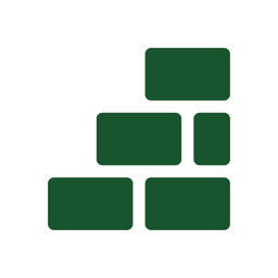
Square icon
PNG
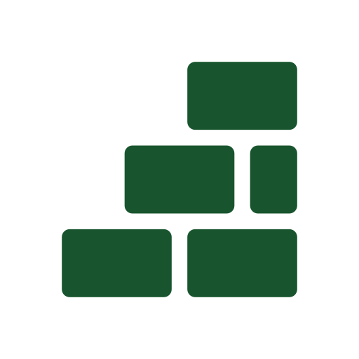
The mark on white at 512px, for avatars and anywhere a vector will not go.
Download PNG


Anything else
Need something that is not here?
A different format, a lockup for a specific space, or a question about using the mark in a partnership? Ask, and someone will answer with the file rather than a form.
Get in touchCurious what the wall is a metaphor for rather than what it is drawn with? That is the MoneyFesto.